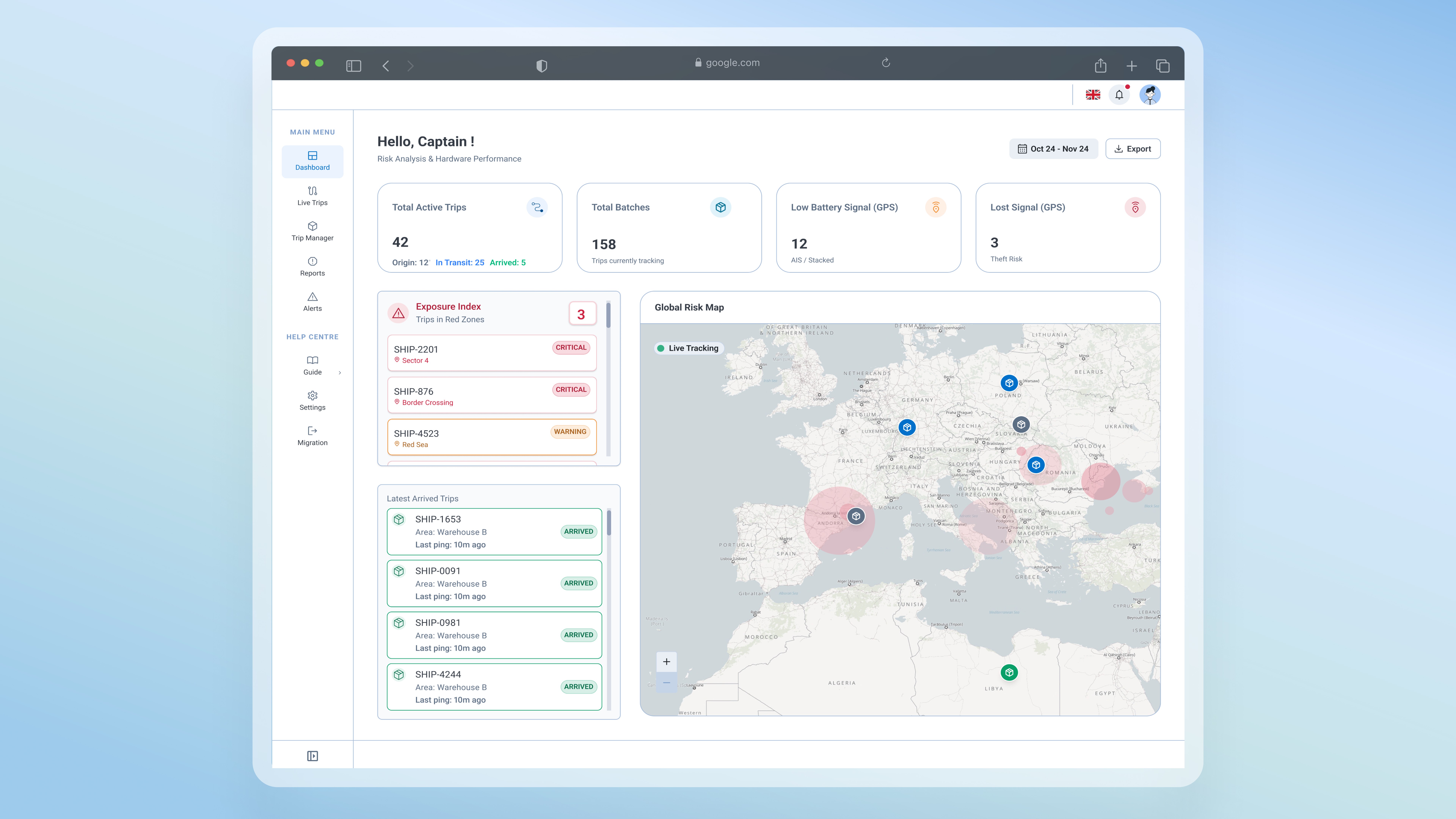
App Design
Drive Mode
AI Assisted Design System
Self-directed exploration
One design system, three platforms, and an experiment to see if it could hold
Overview
Auditing a mobile mapping app for field use surfaced a deeper problem than the UI. The system underneath had been built for a desktop context, never for the conditions its products are actually used in. That gap became a question I wanted to answer for myself. Could one design system hold up across every surface it has to serve, from a phone to a moving vehicle to a headset, rebuilt with AI-assisted generation and held to real industry standards: Apple HIG for mobile, NHTSA and Google Design for Driving for the vehicle, visionOS HIG for spatial? I built it to engineering handoff quality so the question would be tested honestly, not as a mockup.
[DESIGN DECISION]
This didn't start as an assignment. It started as a question. I wanted to know where the system would break before I trusted it to hold.
Problem Area
The same components, at each platform's minimum
The mapping app alone runs in two places that share almost nothing: a phone in someone's hand and a screen in a moving vehicle. But the design system underneath serves more than this app, and one of those surfaces is a headset. One system, three sets of physics, built for none of them.
Audit & Results
A UI audit that turned into a system fix
The audit confirmed the UI failures were symptoms of a missing foundation. Patching individual screens would not hold.
What the app assumed
User is seated, stationary, with full attention on the screen
User has time to explore menus and learn custom interaction patterns
Long press and multi-step gestures are reliable inputs
Users come to the app fresh, search for tools, and read user guides
What the field looked like
Users in moving vehicles, with divided attention
Zero tolerance for learning. Decisions are made in seconds, not minutes.
Physical movement makes precision gestures unreliable
Need for fast decisions, accessible tools.
[DESIGN DECISION]
The goal: extend what existed without breaking it, preserving all token connections and variable bindings so engineering could implement without a parallel codebase.
The DS Expansion
Expanding the design system across three platforms
The goal: extend what existed without breaking it, preserving all token connections and variable bindings so engineering could implement without a parallel codebase.
| Component | Why it's a priority | Mobile | Drive mode | VR / XR |
|---|---|---|---|---|
| <Button> | Primary action across all contexts | 44–52pt | 76–96dp ↑ | 60–104pt ↑ |
| <FAB> | One tap immediate escalation | 56pt | 96dp ↑ | 80pt ↑ |
| <Alert> | Status communication | Standard | High contrast, large | Spatial, anchored |
| <BottomNavigation> | Context switching under cognitive load | 48pt row | 80dp row ↑ | 80pt row ↑ |
| <AppBar> / <Toolbar> | Persistent orientation anchor | 56pt | 80dp ↑ | 88pt ↑ |
| <Chip> | Status filters, quick selection | 32pt visual * | 76dp ↑ | 64pt ↑ |
| <Snackbar> | Non-blocking status feedback | Standard | Persistent, large | Spatial overlay |
7 component groups extended across three platforms, every variant still bound to the original tokens

The same route panel in both modes. Drive strips it to three actions: reroute, dismiss, SOS. Nothing that needs reading survives.
The drive mode UI is generated using the Agentic design system built for prototyping using LLM.
Step-by-step building the DS
AI-Assisted generation
I used AI with Figma MCP to programmatically generate the expanded component library against hard platform constraints.
01
Platform standards research
Mapped best practices from Mapped Apple HIG, Google Design for Driving, NHTSA, and visionOS HIG requirements to concrete sizing and interaction rules, codified as reusable AI skills so every generation run inherited the same constraints. This also included component relations and violations (rules set) for the AI to understand how the components work together.
Standards defined before any component was touched
02
Component Auditing
Not every component needed rethinking equally. I audited our apps to identify components used in interaction-critical, high-stress, non-seated environments.
7 component groups prioritized
03
AI: Programmatic generation via Figma plugin
The AI created components by cloning from the originals, not duplicating, to preserve all variable bindings and design token connections.
Six new platform-specific pages were generated across mobile, Drive Mode, and VR/XR. 1,512 new variants total.
04
Auditing & Testing the new Components
Multiple violations surfaced, worst in Drive Mode where restyled components shipped without their variables. Full breakdown below.
8 structural bugs caught · 10+ manual fixes for tokens and variables
05
Documentation on every page
All 9 platform pages include documentation headers and spec tables. Any engineer or designer picking up this file can understand the sizing rationale, the platform standard it references, and how to implement it without needing to ask.
9 pages documented · engineering-handoff ready
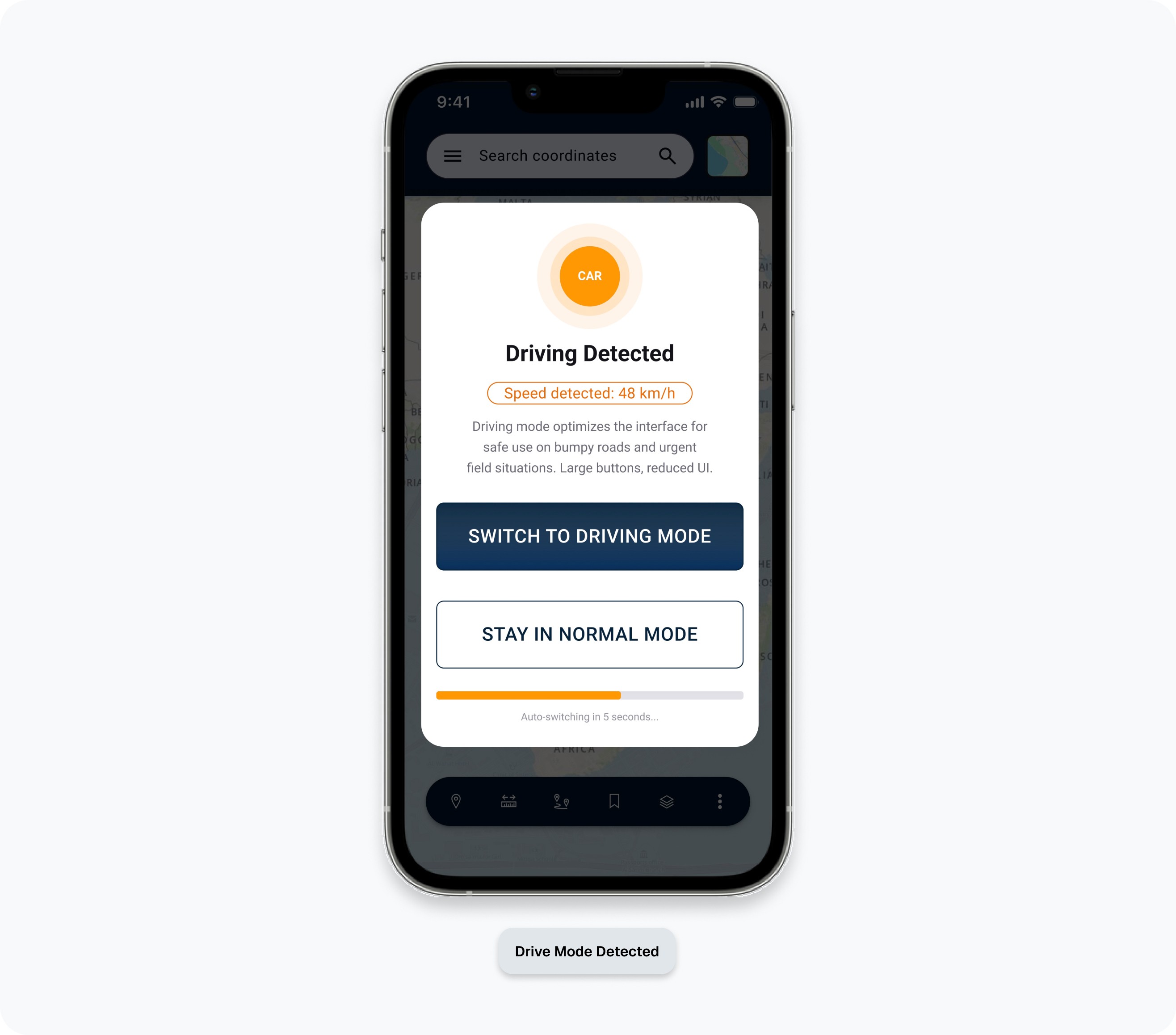
The app detects driving from speed and offers the switch itself, with a 5 second auto-switch. Safety is not left to the user remembering a setting.
The Results
One UI design library, 3 different contexts
Standard mobile
Users on foot. Seated or standing. Standard cognitive load.
Context 01
Drive mode
Users in moving vehicles. Vibration, divided attention, physical and cognitive stress. NHTSA glance limits and Google Design for Driving minimums apply.
Context 02
VR / XR
Headset use. Spatial interfaces, gaze and gesture input, no physical touch surface.
Context 03
Every page ships with its spec table and the standard it references. No questions needed at handoff.
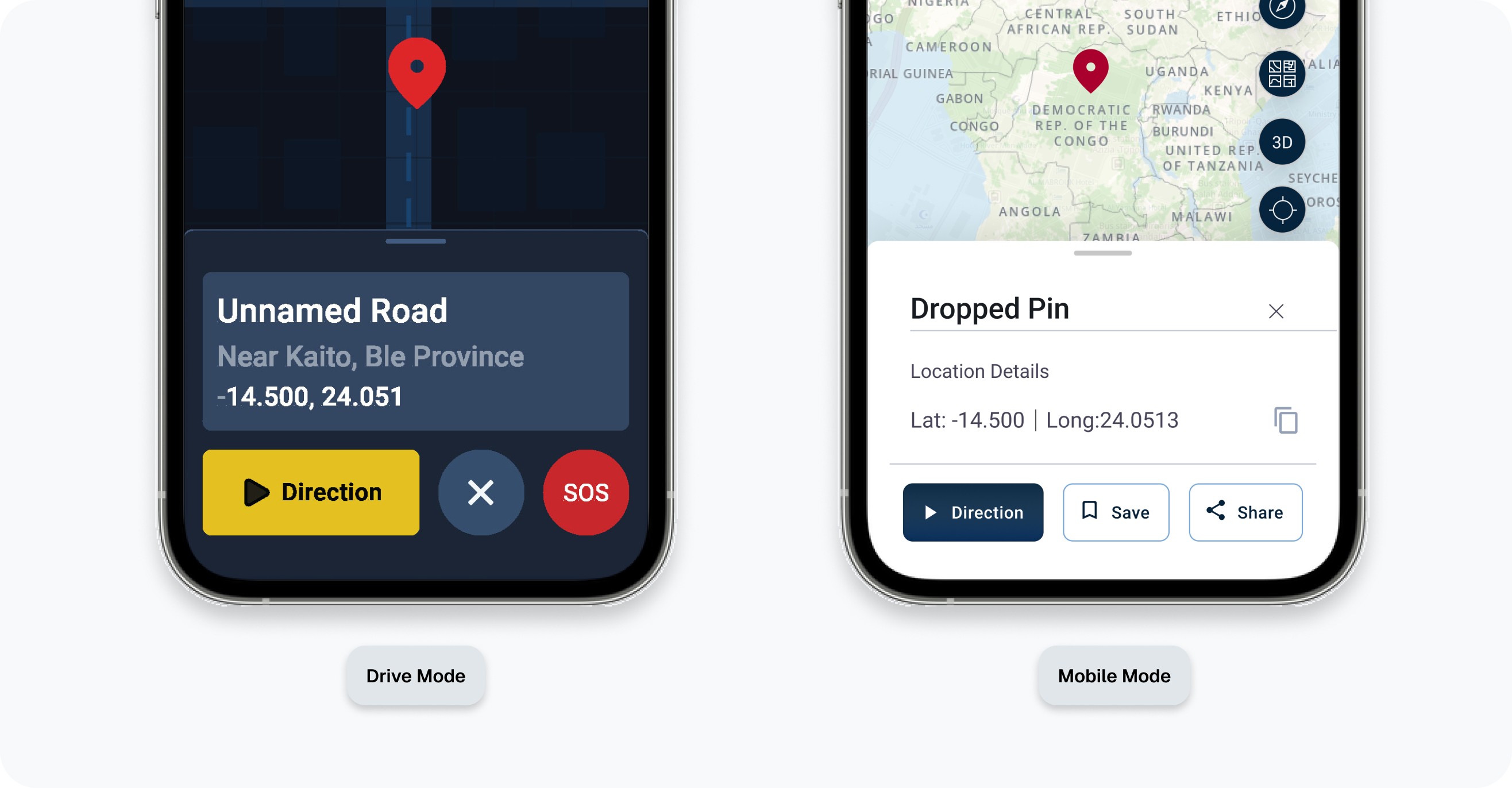
One component, two sets of physics. Mobile gets details and share options, Drive gets coordinates readable in a glance and a yellow action no one has to search for.
AI Challenges & Failure
The bugs manual review missed
Problems found
Low Contrast Glare Risk: White on orange text created a luminance ratio below 3:1, risking "wash out" in sunlight.
Issue
Inaccessible Tokens: The AI changed the colour on the variant and did not generate a new mode.
Issue
Alerts Overload: Alerts contained 10+ words, violating the "2 Second Glanceability" safety rule.
Issue
Fix applied
Shifted to a 7:1 contrast ratio using high luminance accent borders and dark neutral backgrounds.
Fix
Created a new Mode within the variables and manually updated the size and style variants.
Fix
Cut all active drive notifications to three word status tokens (e.g. DANGER: CLOSED).
Fix
[FINDINGS]
The most important finding: most AI violations traced back to pre-existing broken variants in the original design system components. The expansion didn't create new debt, it exposed debt that already existed and had never been caught
Success Metrics