
Mission-Critical SaaS
2026
From false alarms to certainty: 5 minutes to >60 secs
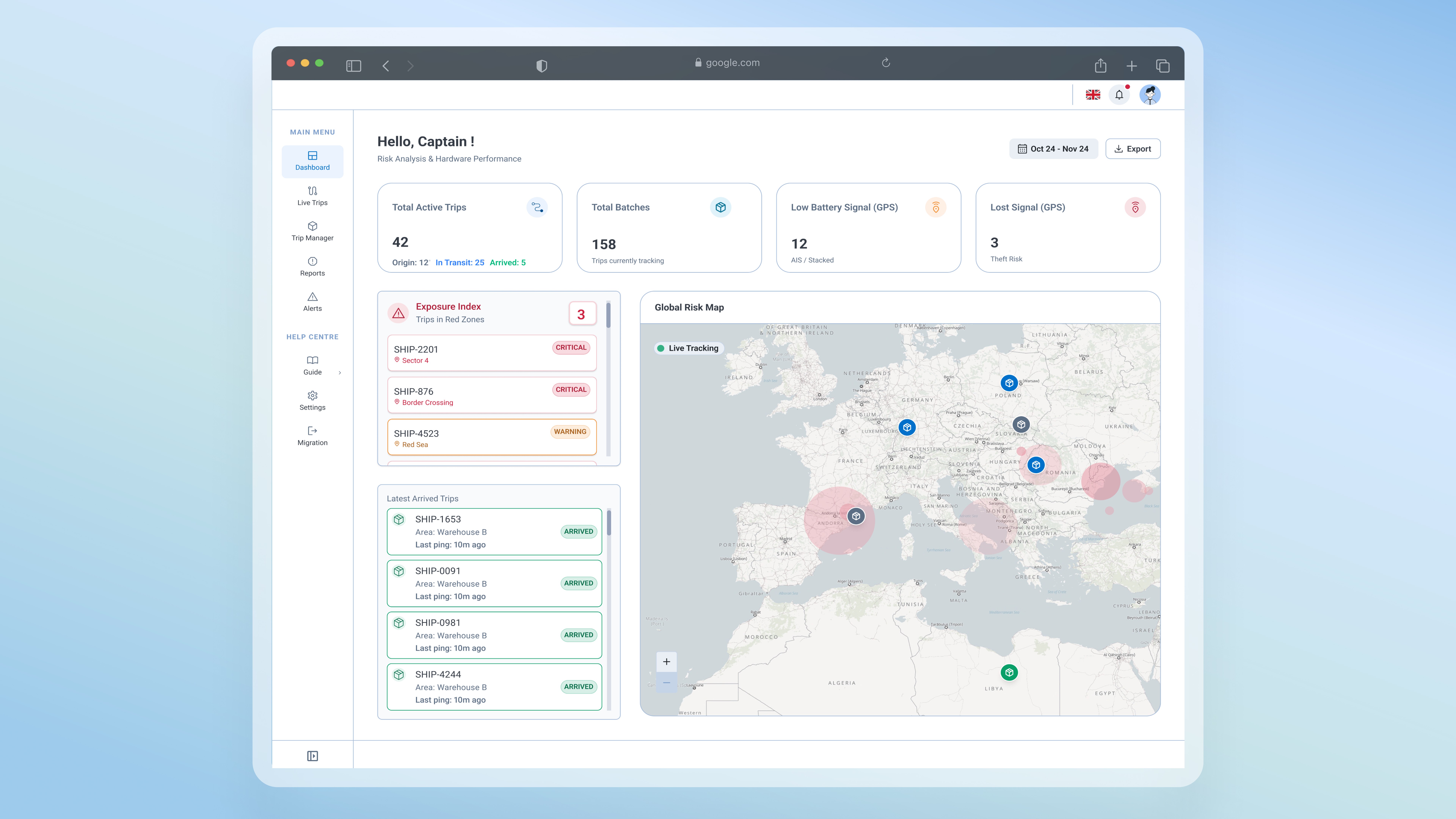
Project under NDA
Visuals recreated and data anonymized to respect confidentiality. Happy to walk through specifics in a conversation.
Overview
The logistics app is a shipment tracking platform used to monitor assets being shipped worldwide, including shipments that may pass through monitored zones. I led the transformation of the logistics app from a messy Excel-like database app that often reported false decisions into a real-time tracking platform. The new architecture dropped the window for critical decisions from 5 minutes to just 60 seconds.
Problem area
UX Problem: Failure to monitor assets
Stakeholders reported failures when monitoring shipments on the app and finding their shipments easily. I audited the application against industry-standard benchmarks to understand and identify failures. This was not just a UI issue; it was a complete lack of operational hierarchy that caused panic and led to wrong decisions. The feedback and the audit clarified that:
Decision
From auditing, project design management to platform redesign
After the audit, I was able to identify the gaps in the previous app design and create a design plan for the new platform design. Due to the complexity and scale of the app, the team decided to work in phases.
01
Tracker Live View
Users can navigate through all live trips that are created and monitored by their units.
Dashboard
This section provides stakeholders with insights on critical information, including shipments in monitored zones and shipment status.
Phase 01
02
Alert System & Shipment Path History
Creating a full alerting system
Phase 02 — Design–Dev Sync
03
Phase 03
Admin View
Separating heavy excel database tables into the admin view, so unit's adminstartors are able to review and control the database.
Trip Manager
Giving admins the possibility to create and add trips to deliever shipments
Solutions
Tracker Live View vs. Admin View
I simplified the user flow while preserving raw data access for admin staff. This helped users easily navigate through the app and find shipments in less than 60 seconds. Users can search for and find shipments through the map or the live trip panel.
Before
After
Decoupled Architecture
01
I separated live operations from data administration: "Live View" for active trip monitoring
02
I created a "Macro View" dashboard for users to get instant insight into shipment's status.
Operational intelligence: Detailed insights on assets
Before
When a GPS losses signal, the old system showed a generic "No Location" red alert with zero shipment history or "last seen" location or even the type of tracking. This caused immediate panic, as users couldn't tell a minor hardware error from a lost shipment.
After
I stopped the panic and false decicions by designing a full details panel.
01
User can map the shipment's exact journey history and last seen location.
02
Added chips to show GPS's to track battery status.
03
GPS status banner: Displays the specific hardware status eg: GPS is "sleeping")
Success Metrics